Author’s Note by Alex Deng, Production Manager: After 12 years on the production floor, I’ve watched too many buyers learn the hard way that “300gsm” doesn’t mean the same thing at every mill — or that a wrong grain direction can crush a card’s edge right off the die-cutter. I wrote this guide from the machines up, not the marketing deck down. Here’s what actually determines whether your flashcards survive a classroom, or a return shipment.
If you’ve searched for “paper flash cards,” chances are you’ve landed on a pile of DIY tutorials, home-printer settings, and blank index card listings on Amazon. That’s fine if you’re making a dozen cards for personal use.
But if you’re sourcing flashcards for a school district, a training program, or an EdTech product line, the question isn’t whether you can print at home. It’s whether the cards you order will survive the hundredth flip, the thousandth flip, and whether your supplier actually understands the difference between a card that looks good in a product photo and one that survives a full school term in a real classroom.
This guide skips the printer settings and craft-store advice. Instead, we’ll walk through how to choose between the two most common cardstock weights in professional flashcard printing — 300gsm and 350gsm — based on how the cards will actually be used, plus the coating, pre-press, and logistics factors that only become obvious once you’re ordering at scale instead of printing a single deck at your desk.

Show-through comparison between 80gsm paper and 300gsm cardstock flashcards
Why Flashcards Need Real Cardstock, Not Regular Paper
Standard printer paper — the kind sitting in most office trays — runs around 80gsm (grams per square meter). It’s perfectly fine for a worksheet you’ll toss after one use. It falls apart as a flashcard.
Here’s why:
- It shows through. At 80gsm, text on the back of a card is often visible from the front under normal classroom lighting — a real problem when the whole point of a flashcard is to hide the answer until you’re ready to see it.
- It doesn’t survive handling. A stack of standard paper starts curling and fraying at the edges within days of regular use, not weeks.
- It feels wrong in the hand. Anyone who’s used a real flashcard deck knows the snap and rigidity that make it satisfying to shuffle. Thin paper just flops.
This is why true cardstock — a heavier, stiffer paper stock — is the industry baseline for flashcard printing. Generally speaking, anything under 200gsm doesn’t hold up well enough to be considered genuine cardstock for a repeated-use product like this. Above that threshold, you start getting the opacity and rigidity that makes a flashcard feel like a flashcard instead of a printout.
The Hidden Physics: Grain Direction Matters as Much as Weight
Here’s something most buyers never think to ask about, and most suppliers never bother explaining: even a 250gsm sheet can feel surprisingly limp if the grain direction is wrong.
Paper is made of wood fibers that align in one direction as the sheet forms on the manufacturing wire. If a card is cut so the grain runs parallel to the short edge, it will bend and feel weak no matter how heavy the stock is. Cut correctly — with the grain running parallel to the long edge — the same paper holds up noticeably stiffer in the hand, with no change to the weight at all.
This is a detail most first-time buyers never see mentioned anywhere, because it only becomes obvious once you’re standing on a production floor watching a die-cutter run. It’s also why two “300gsm” decks from different suppliers can feel completely different once you actually pick them up.
From the production floor: we’ve seen clients try to save a few cents by combining a lighter stock with a cross-grain cut. On our die-cutters, that combination tends to crush the edge fibers instead of slicing them cleanly, leaving visibly frayed borders right off the press — and forcing us to slow the whole run down to compensate. Grain direction isn’t a nice-to-have; it’s the difference between a clean edge and a wasted print run.

Side-by-side thickness comparison of 300gsm and 350gsm flashcard stock
300gsm or 350gsm? Choosing the Right Weight for Your Use Case
In our production line, two weights come up again and again: 300gsm and 350gsm. Both sit well above the “true cardstock” threshold, but they aren’t interchangeable — the right choice depends entirely on how often the cards get picked up, flipped, and passed between hands.
| Use Case & Frequency | Recommended Weight | Feel & Durability | Best For |
|---|---|---|---|
| Daily classroom teaching, adult self-study, moderate handling | 300gsm | Firm, comfortable grip; resists warping under normal use | Language learners, training centers, standard classroom kits |
| High-frequency gripping, multi-user rotation, young children | 350gsm | Noticeably stiffer; resists bending and edge fraying much longer | Early childhood education, shared institutional sets, high-turnover teaching tools |
300gsm: The Workhorse Standard
Here’s a rule of thumb from the floor: 300gsm comfortably covers the majority of standard educational use cases.
If your flashcards are aimed at adult language learners, test-prep students, or corporate training programs, 300gsm delivers a premium feel without unnecessary bulk or unnecessary shipping weight.
Case in point: one ESL training provider originally tried to cut costs by printing 100,000 decks on 250gsm stock. Within weeks of classroom use, the cards were visibly warping. Moving up to 300gsm resolved the issue entirely — enough rigidity to handle daily adult use, without pushing unit costs higher than necessary.
350gsm: Built for Rough Handling
Reserve 350gsm for situations where you already know the cards are heading into aggressive, high-frequency use.
Case in point: premium early-childhood brands lean on 350gsm almost by default, often paired with rounded corners. Toddlers don’t have refined motor control — they bend cards, chew on corners, and fold decks in half without thinking twice. The extra density in 350gsm resists creasing in exactly the situations where thinner stock would fail within days.
A stack of 300gsm cards handled by one teacher through a school term holds up just fine. Hand that same stack to a room of six-year-olds, where every card gets grabbed, dropped, and reshuffled dozens of times a day, and 300gsm starts showing soft corners much sooner. That’s the gap 350gsm exists to close.
The Freight Factor Buyers Often Miss
Paper weight isn’t just about feel — it’s also about shipping cost, and this is where a lot of first-time buyers get caught off guard.
Moving from 300gsm to 350gsm typically increases the total shipment weight of a large order by roughly 15–20% (this varies by paper mill and card dimensions, so ask your supplier for exact figures on your specific spec before finalizing).
If you’re shipping via ocean freight, that difference is close to a rounding error. But if your launch timeline forces you into air freight, that extra weight per card can add up to a meaningful line item on your logistics invoice. Always run your landed cost numbers before defaulting to the heaviest stock available — the toughest card isn’t always the smartest business decision.
How Coating Affects Handling, Writing, and Durability
Paper weight determines how sturdy a card feels. Coating determines how it behaves once it’s actually in someone’s hands — and it has a real effect on how the card performs coming off different printing and finishing equipment.

Gloss finish versus matte lamination comparison on printed flashcard
Matte vs. Gloss
- Matte finish gives a smooth, non-glare surface that’s much easier to read under harsh fluorescent classroom lighting, and easier to write on with pencil, pen, or dry-erase marker. It also resists fingerprint smudging, which matters when a deck gets passed around a room all day.
- Gloss (or satin) lamination produces punchier color reproduction and a polished, retail-ready look. It’s the standard choice for children’s flashcards because it wipes clean with a damp cloth. The trade-off is more visible glare under bright lighting, and fingerprints show up more readily on decks that see heavy multi-user handling.
For flashcards meant for repeated handwritten use — vocabulary drills, math practice — matte is usually the smarter default. For flashcards with finished, locked-in artwork that need a premium, retail-shelf look, gloss lamination often makes the stronger visual impression.
Three Finishing Rules That Prevent Costly Production Failures
1. The dark-color rule. If your design leans on large blocks of dark, solid color — navy, deep purple, black — and you want a matte finish, be aware that standard matte lamination shows scratches, scuffs, and fingerprints almost immediately. Anti-scratch matte laminate is the safer standard here; it protects the perceived quality of the product where regular matte would visibly wear within the first few uses.
2. Writability vs. protection. If your cards need to be written on with pencil or pen, lamination is off the table — laminate adhesive won’t bond properly to a porous, uncoated surface, and you’ll get bubbling and peeling instead of a clean finish. The fix is a matte varnish instead of full lamination: it seals the ink and adds edge protection without sacrificing the writable texture.
3. Spot UV and foil never overlap. If your design includes Spot UV (raised gloss) or hot foil stamping — often used on packaging or premium card backs — those two elements can’t physically overlap in the artwork. Foil under Spot UV will flake and peel during normal handling. Your design files need to keep those elements clearly separated.
A note on timing that surprises a lot of first-time buyers: rushing a production schedule is one of the most common causes of lamination failure down the line. Heavy offset ink needs time to properly cure — typically a day or two — before lamination film goes on. Skip that curing window, and trapped gas from the ink can cause the film to bubble and lift weeks after the cards have already shipped. If your supplier is quoting an unusually fast turnaround on a laminated run, it’s worth asking how they’re handling ink cure time.
Coating and finishing choices go hand in hand with options like rounded corners and edge lamination, both of which extend a deck’s lifespan even further for high-frequency or young-user use cases — details worth exploring separately once you’ve settled on a weight and finish.
Pre-Press Basics That Save You a Reprint
Once the paper weight and coating are locked in, the next place production runs go wrong is at the file stage — long before the press even starts. Your artwork needs to be built for industrial offset printing, not for a screen or a desktop inkjet, and a few habits from digital design work will cause real delays on a factory floor if they slip through.
Color and Ink
- CMYK is non-negotiable. All files need to be converted from RGB to CMYK before they reach the press. RGB allows for saturated neons and blues that simply don’t exist in physical ink — what looks vibrant on your monitor can look flat and muddy once it hits paper.
- Watch your black. If your design uses deep, rich blacks, avoid setting all four channels to 100% (400% total ink coverage). That much ink pools on the paper, forcing the press to slow down to let it dry — or worse, causing wet ink to transfer onto the back of the card stacked on top of it, a defect known as “offsetting.” Keep total ink coverage under roughly 300% and use a rich-black formula instead, such as C:60 M:40 Y:40 K:100.
- Lock in brand colors with Pantone. If you’re printing a card series across multiple years or multiple print runs, don’t rely on CMYK alone to keep colors consistent. A Pantone (PMS) spot color ensures your brand color matches exactly, batch after batch.

Bleeds, Borders, and Proofing
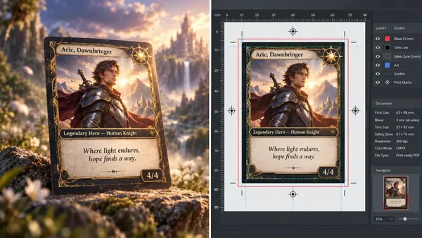
- Build in a bleed. Heavy cardstock shifts slightly when an industrial die-cutter punches out hundreds of cards at once. Your files need a 1/8″ (3mm) bleed — background color extending past the actual cut line — to avoid thin white slivers at the edge.
- Skip razor-thin borders. Avoid decorative borders under 1/8″ (3mm) around the card edge. A shift of even a millimeter during die-cutting is enough to make a thin border look visibly off-center.
- Understand what a proof actually shows you. A digital proof (printed on a high-end inkjet) and a press proof (printed on the actual offset press with wet ink and metal plates) will show a slight, normal color variance between them. Agree on an acceptable tolerance with your supplier before signing off on production — it saves a lot of back-and-forth later.
Frequently Asked Questions
What is the best cardstock for flashcards? For most professional and educational applications, 300gsm coated cardstock is the industry standard — it balances cost, comfortable handling, and durability well. For heavy-duty use by young children or shared institutional sets, 350gsm is the better call.
Is 350gsm always better than 300gsm? Not necessarily. Heavier stock adds cost and shipping weight without adding real value if your use case doesn’t call for it. A set that spends most of its life in one teacher’s hands doesn’t need the same thickness as a set that gets passed between thirty kindergartners every day. The right weight is the one matched to actual handling frequency, not simply the highest number available.
What kind of paper is used for flashcards? Professional flashcards are typically printed on coated art paper (C2S, coated two sides) for strong color reproduction and reliable lamination bonding. When full opacity is a hard requirement — meaning answers genuinely can’t show through even held up to a bright window — manufacturers step up to black-core or blue-core paper, which has a light-blocking layer built into the center of the sheet.
What paper is used for flashcards? Beyond the base cardstock weight, the surface is almost always treated with a finish — matte or gloss lamination, or a matte varnish for writable cards — to protect the printed ink from the oils and moisture that come with repeated handling.
What is the best paper size for flashcards? Custom die-cut sizes are always an option, but 2.5″ x 3.5″ (standard poker size) is the most common and economical choice for vocabulary and adult learning, while 3.5″ x 5″ or 4″ x 6″ is typical for early childhood education, where the larger surface accommodates bigger fonts and simple illustrations.
Ready to Print Your Custom Flashcard Deck?
Grain direction, ink limits, lamination timing — none of this needs to be a guessing game on your end. Whether you’re outfitting a single training center or launching a flashcard line across a national EdTech platform, getting the physical spec right the first time protects your margins and your brand’s reputation.
We run everything from small prototype batches to full bulk production, and we keep MOQs low enough for you to test before committing to a large run. If you’re on the fence between 300gsm and 350gsm, or matte and gloss, we’ll send you free samples from past production runs — real cards, not mockups — so you can feel the difference yourself before locking in a spec. You only cover the shipping cost to get them to your door. Reach out to our team to request samples and get a freight-inclusive quote for your project.